Creating a design system - Confused.com
Confused.com Design System
Tools: Figma • Illustrator • Zeroheight • Storybook
Role: Senior UI Designer / Design System Lead
Duration: 2023 - (ongoing)
__________________________________________
Overview:
Confused.com needed a unified, scalable design system to align product, marketing, and internal tools. I led the creation of a simple, flexible, and accessible visual language that supports clarity across every digital touchpoint.
__________________________________________
The Challenge:
Rapid product growth had created inconsistent interfaces, duplicated components, and slow delivery cycles. The goal was to build a single source of truth that improved efficiency while reinforcing the brand.
__________________________________________
My role:
I led the design system initiative, collaborating with product, brand, and development teams. Responsibilities included:
• Defining design tokens (colour, type, spacing, iconography)
• Building a reusable Figma component library
• Embedding accessibility into all UI patterns
• Documenting guidelines in Zeroheight
• Running workshops to drive cross-team adoption
__________________________________________
Approach:
I began with a full UI audit to identify inconsistencies and opportunities for consolidation. Using these insights, I created the foundational styles and core components, then expanded into more complex patterns. Documentation and workshops ensured the system was easy to use, adapt, and maintain across teams.
__________________________________________
Outcome & Impact:
The design system became the central reference point for all digital design, delivering:
• Faster design and development workflows
• A consistent, brand-aligned UI across products
• Reduced duplication and improved team alignment
• A scalable foundation for future features and platforms
__________________________________________
Why It Matters:
This project demonstrates my ability to lead design direction, collaborate across disciplines, and create systems that improve product quality, speed, and long-term scalability.
__________________________________________
Results:
• 2× faster design and development velocity through shared libraries and reusable components.
• Improved cross-team collaboration, with designers, developers, and stakeholders aligned around the same visual and functional language.
• Streamlined third-party integration, supported by live, interactive documentation in Zeroheight and Storybook.
Today, the design system continues to evolve — a dynamic ecosystem that empowers Confused.com to scale confidently while staying true to its mission of clarity.
Product quote journey redesign - Confused.com
Confused.com Quote Journey Redesign
Tools: Figma • Illustrator • Adobe XD
Role: Senior Visual Designer
Duration: 2022 (on-going improvements)
__________________________________________
The Approach:
To modernise Confused.com’s quote journeys, I led a strategic redesign grounded in clarity, accessibility, and visual coherence. My focus extended beyond aesthetics: I aligned user needs, brand expression, and technical constraints to build a system that scales across products and platforms.
Through user research, iterative prototyping, and cross-functional workshops, I identified the key points where users felt uncertainty. These became opportunities to strengthen trust through cleaner hierarchy, more intentional interactions, and a more expressive yet unobtrusive visual language.
__________________________________________
Key Contributions:
Reimagined the end-to-end quote experience
• Redesigned the full home and car quote journeys — from form flows to results screens — with a focus on clarity, reduced friction, and stronger alignment to brand principles.
Crafted a high-performing visual system
• Refined typography, spacing, colour, and layout to create a visual rhythm that improves scannability and reduces cognitive load.
• Established consistent visual behaviours for states, interactions, and error handling to improve usability.
Built a scalable component library
• Developed a modular component system enabling cross-product consistency and faster design/development cycles.
• Documented patterns and usage rules to ensure repeatable, high-quality execution across teams.
Elevated accessibility and inclusivity
• Embedded WCAG-compliant patterns into every component and flow, improving readability, contrast, form usability, and assistive-technology support.
Validated with real users
• Prototyped and tested interactions with users to uncover behavioural patterns and refine visual decisions.
• Used analytics to guide prioritisation and measure the impact of changes.
This was not a visual refresh — it was a foundational redesign that unified behaviour, brand, and product strategy.
__________________________________________
The Outcome & Impact:
The redesigned quote journey now reflects Confused.com’s promise of simplicity by delivering a cleaner, more confident user experience — one that is consistent, accessible, and built for scale.
__________________________________________
Results:
• +2% increase in conversion since the late-2022 launch.
• Users report greater clarity, reduced confusion, and easier navigation through lengthy forms.
• A unified design language now spans journeys, devices, and platforms — enabling faster iteration and future product expansion.
• The new system significantly reduced design/development overhead and improved cross-team alignment.
__________________________________________
Product quote journeys:
Embed Just Used Confused.com brand
Tools: Figma • Illustrator • Photoshop
Role: Senior UI Designer
Team: Collaboration with the internal marketing team, agency creatives, copywriters, and product stakeholders
Duration: 2024
__________________________________________
Overview:
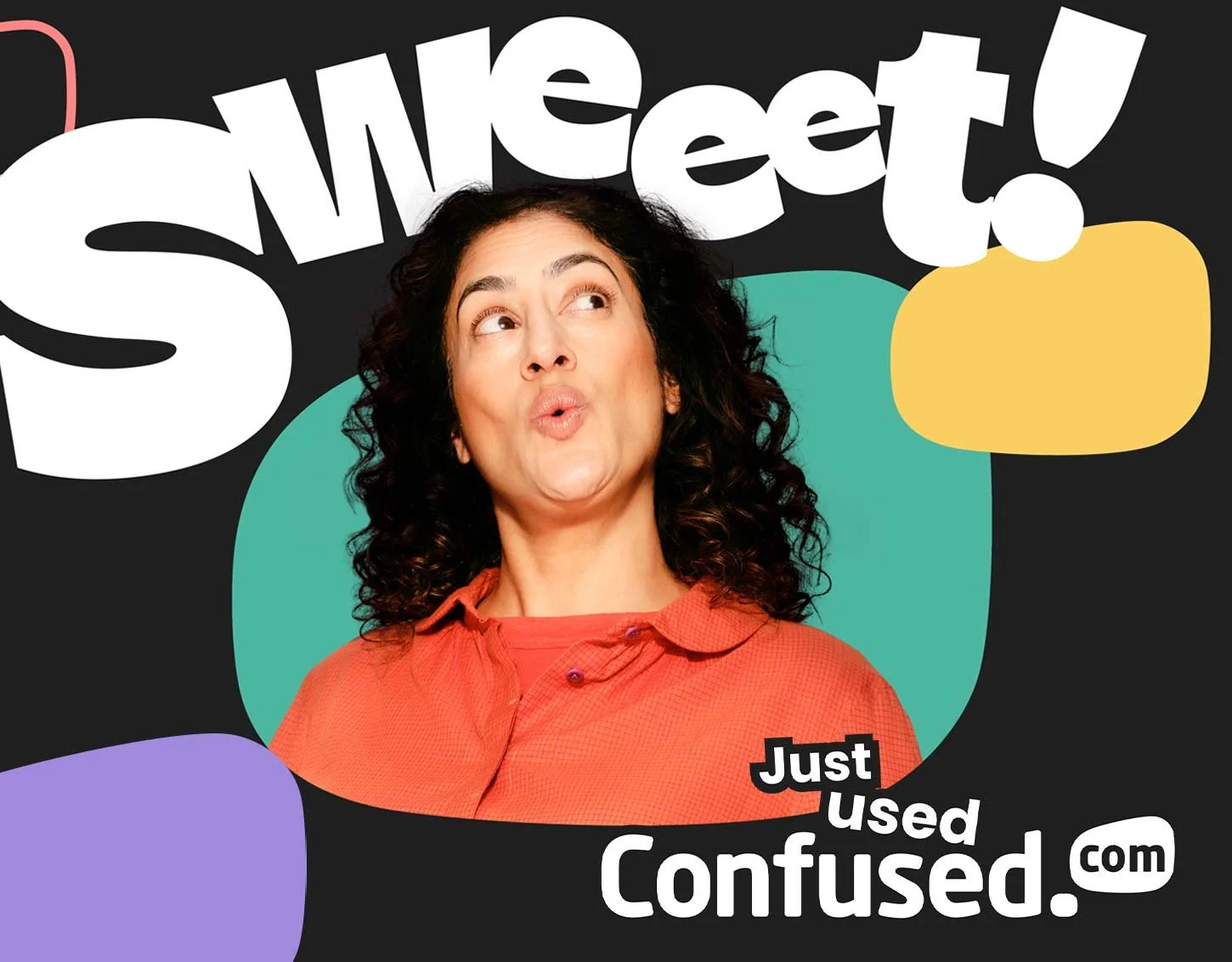
For Confused.com, I led the visual design implementation of the new “Just Used Confused.com” brand across multiple marketing channels and product pages.
The brand update to the ‘Just Used Confused’ positioning was to resonate with customers the feeling of lifting the burden of getting insurance as a mundane task and the feeling of relief when you finally get it out of the way when you use Confused.com
To resonate further with customers there was a need to create a connected feeling through visual comms for users visiting the Confused.com of demonstrating that relief aspect.
__________________________________________
The Challenge:
The business wanted to embed the new brand style across all marketing touch-points quickly and consistently. Challenges included:
• Tight deadlines for campaign launches
• Multiple stakeholder needs and feedback loops
• Aligning the new agency-led creative direction with existing marketing and product journeys
__________________________________________
Goals & Success Metrics:
• Increase brand awareness by integrating the “Just Used Confused.com” identity
• Improve conversion rates across digital channels
• Ensure visual consistency across ads, landing pages, emails, and social media
__________________________________________
Research & Insights:
Before creating assets, I reviewed:
• The agency’s brand guidelines and creative direction
• Previous campaign performance and messaging tone
• Audience insights to inform visual hierarchy, CTAs, and messaging clarity
These insights informed a design approach that balanced creativity, brand consistency, and conversion-focused usability.
__________________________________________
Creative Process:
• Brand Integration: Adapted agency creative direction to digital and product touch-points.
• Design Iteration: Developed multiple visual treatments for ads, landing page modules, emails, and social posts.
• Collaboration: Worked closely with stakeholders to gather feedback while maintaining the integrity of the new brand style.
• Rapid Execution: Prioritised high-impact deliverables due to tight deadlines without sacrificing quality.
__________________________________________
Why It Matters:
This project demonstrates my ability to lead design direction, collaborate across disciplines, and create systems that improve product quality, speed, and long-term scalability.
__________________________________________
Solution:
• PPC Ads: Designed responsive display and search ads aligned with the new brand style.
• Landing Pages: Modular components optimized for conversion while reflecting updated visual identity.
• Emails: On-brand templates and assets to engage and convert users.
• Social Assets: Created posts and graphics consistent with the campaign’s look and feel.
Consistency, clarity, and brand personality were applied across all touchpoints, ensuring a seamless user experience.
__________________________________________
Execution & Production:
• Delivered production-ready files compatible with marketing platforms
• Created templates for future campaigns to streamline execution
• Collaborated with engineers and marketing team to ensure correct implementation of assets
__________________________________________
Results & Impact:
• Positive feedback from stakeholders on the seamless integration of the new brand
• General improvement in brand awareness across marketing channels
• Assets were scalable for future campaigns, ensuring long-term visual consistency
__________________________________________
Reflections & Learnings:
• Clear brand guidelines make rapid implementation easier
• Early alignment with stakeholders prevents last-minute revisions
• Modular design systems are crucial for campaigns with tight timelines
__________________________________________
Contribution Summary:
I was responsible for translating agency creative direction into actionable marketing assets, ensuring brand consistency, and maintaining high-quality design execution across PPC, landing pages, emails, and social. Tools used: Figma, Adobe Suite, and marketing asset platforms.
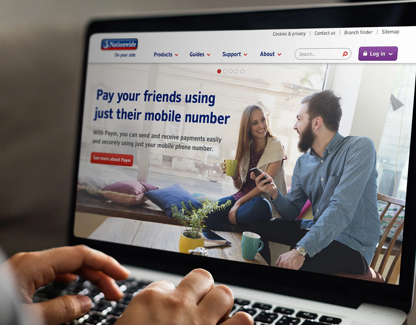
Nationwide digital channels deliverables
Client: Nationwide
Software used: Photoshop, illustrator
Role: Design, illustration, animation
__________________________________________
Overview:
As part of Nationwide’s in-house creative team, I designed high-impact digital assets across multiple customer touch-points, helping translate marketing campaigns into clear, engaging visual experiences.
Working within a highly regulated financial brand, I balanced creative expression with strict brand governance, ensuring every asset remained consistent with Nationwide’s visual identity while still capturing attention in busy digital environments.
My work supported a range of campaign deliverables including:
- Homepage hero imagery designed to quickly communicate campaign messages and drive engagement on Nationwide’s primary digital entry point.
- Digital display advertising created for responsive placements across desktop and mobile, optimised for clarity, performance and brand recognition.
- ATM interface visuals extending the brand experience into physical banking environments and ensuring visual consistency across customer touchpoints.
- Social media content crafted to stand out in fast-moving feeds while maintaining the trust and professionalism expected of a major financial institution.
Throughout the work, I focused on clarity, hierarchy and visual storytelling, ensuring each asset delivered campaign messages quickly while reinforcing Nationwide’s trusted brand presence.
Dentally website, illustration and iconography
Client: Dentally
Agency: Rally Agency
Role: Illustration direction and design
Visit:https://dentally.co/
__________________________________________
Software used: Sketch, Photoshop, Illustrator
__________________________________________
Overview:
Dentally is a cloud-based practice management platform designed to help dental clinics manage patient records securely from anywhere.
The existing website relied heavily on dense text and lacked a strong visual language, making it difficult for users to quickly understand the product’s benefits and navigate key information.
Working with the team at Rally Agency, the brief was to introduce a clear and cohesive illustration system that could simplify complex messaging, support navigation, and give the brand a more approachable and modern personality.
__________________________________________
My Contribution:
I led the concept and design of a bespoke illustration and iconography system that helped translate Dentally’s product features into clear, visual stories.
The goal was to create a visual language that felt professional, friendly and easy to understand, reflecting the simplicity of the platform itself.
Key design decisions included:
• Developing a consistent illustration style using simple geometric forms and soft pastel tones derived from Dentally’s brand palette.
• Designing supporting icons and spot illustrations to help users scan and understand product features more quickly.
• Strategically placing illustrations throughout the site to break up long-form content and improve visual hierarchy.
• Ensuring the illustration system was flexible and scalable, allowing the brand to expand the visual language across future marketing materials.
__________________________________________
Impact:
The introduction of a cohesive illustration system helped transform the website into a clearer and more engaging product experience. Complex features could now be communicated more quickly, while the visual language added warmth and personality to the brand.
The result was a website that better reflects Dentally’s core promise: simple, modern software built for today’s dental practices.
MiSmile website re-design
Client: MiSmile
Agency: Rally Agency
Visit: mismile.co.uk/
__________________________________________
Software used: Sketch, Photoshop, Illustrator
__________________________________________
Overview:
MiSmile is a UK-wide network of 60+ independent dental practices offering Invisalign—a clear, removable alternative to braces.
__________________________________________
My Role:
Redesigned the MiSmile website to better engage the 25–40 demographic. Focused on creating a more aspirational, vibrant experience using brand-aligned colours, imagery, and tone. The refresh emphasised confidence, lifestyle appeal, and the real-life benefits of Invisalign—making users feel great in any situation.
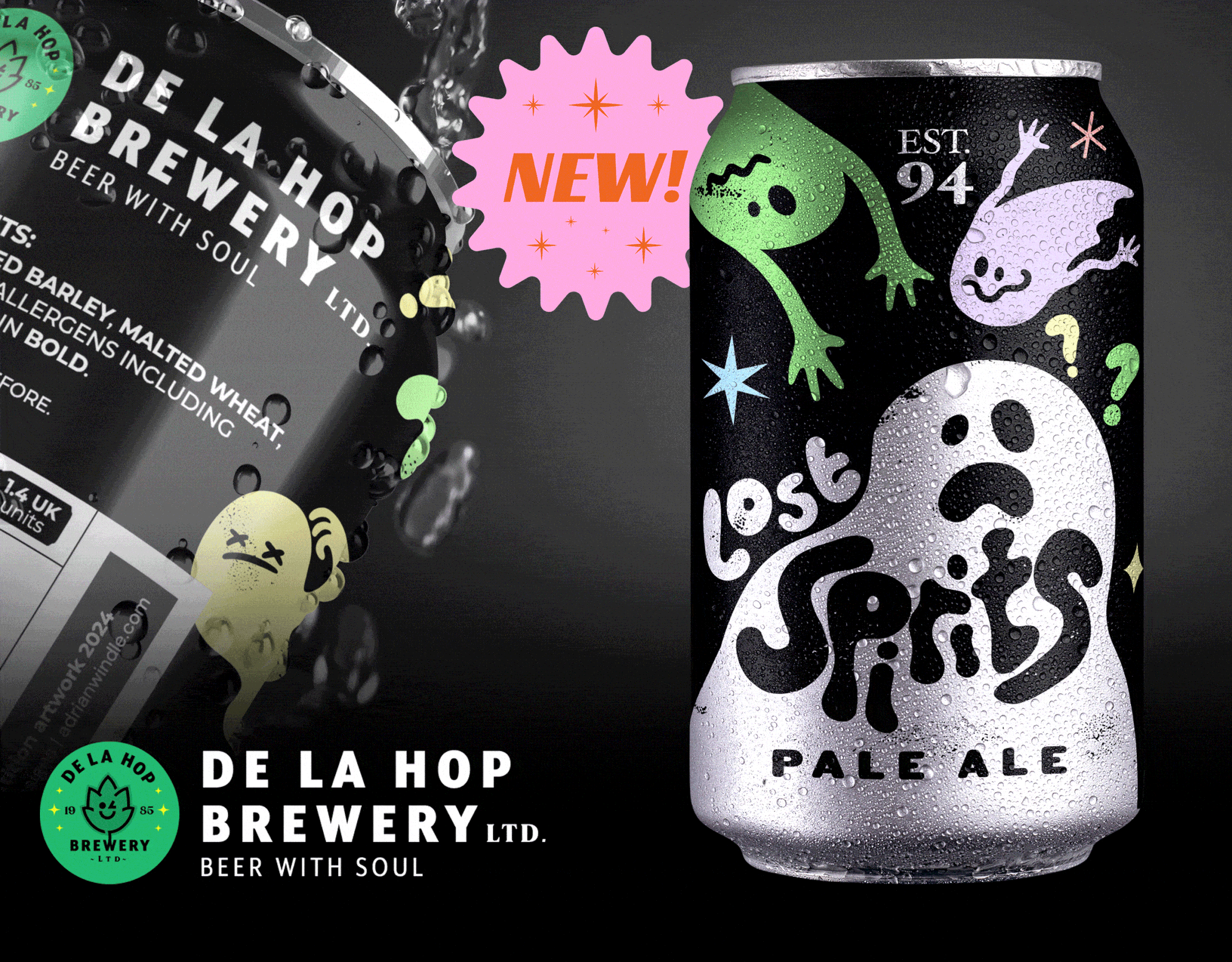
Beer label design
Beer label designs by De La Hop Brewery
Client: Personal project
Role: Design and illustration
__________________________________________
Software used: Adobe Fresco, Photoshop, Illustrator
__________________________________________
Background:
A personal project to create beer label designs based on themes under the name of a fictitious beer brewery called 'De La Hop'.
The beer can design labels that feature on this page are 'Lost Spirits Pale Ale' and Devil Pit Session IPA.
Logo designs
Clients: De La Hop logo, Opportunity DAO logo, Skyward logo
Role: Design and illustration
Software used: Illustrator, Photoshop, Fresco app
__________________________________________
Background:
A combination of paid commissions and self initiated logo designs.
De la Hop logo
A fictitious brewery logo I created as a passion piece with the idea of it being the main brewery where it will feature on future beer label designs.
__________________________________________
Opportunity Dao
https://opportunitydao.com/
A charitable money lending site based in the USA approached me through a contact at another company I was producing some design assets for.
__________________________________________
Skyward Digital
https://skyward.digital/
A UK based SAAS company approached me when setting up their business and required a logo which would sell their lofty expectations.
Invisalign mentoring programme video creation
Client: Invisalign
Agency: Rally Agency
Role: Storyboarding, design and motion design
__________________________________________
Software used: Sketch, Photoshop, Illustrator, After Effects, Adobe Premiere
__________________________________________
Overview:
The Invisalign Mentoring Programme is an educational platform designed to help orthodontists stay up to date with the latest techniques and advancements in Invisalign technology through a series of guided training modules.
__________________________________________
My role:
I developed the visual storytelling and motion design for six training modules within the programme.
Starting with detailed storyboards, I mapped out the structure and flow of each training video to ensure the content was clear and engaging. Once approved, I designed the scenes in Photoshop before bringing them into After Effects to create the animated sequences.
The final animations were assembled and edited in Adobe Premiere to produce the completed training videos, which were then delivered to the Invisalign team for integration into their practitioner training platform.
__________________________________________
Outcome:
The finished videos became part of the Invisalign Mentoring Programme, supporting orthodontists with guided learning and helping practitioners stay aligned with the latest Invisalign practices.
Maynooth website and payment flow
Client: Personal project
Software used: Adobe XD, Photoshop, Illustrator
A personal project that I created on the back of doing a course in UI/UX using Adobe XD. Showing some of my learnings and designing a website and ordering process for a fictitious online furniture store.
Social video creation
Client: MiSmile/Invisalign
Agency: Rally Agency
Role: Design and motion design
__________________________________________
Software used: Photoshop, After Effects, Adobe Premiere
__________________________________________
Overview:
MiSmile uses social media to promote Invisalign treatment through engaging, lifestyle-focused content designed to resonate with potential patients across Facebook and Instagram.
__________________________________________
Challenge:
Create visually engaging social-first video content that communicates the benefits of Invisalign while standing out in fast-moving social feeds and maintaining consistency with the Invisalign brand.
__________________________________________
Approach:
I designed and produced a series of motion-led social videos using a combination of Invisalign branded assets, stock imagery, and motion graphics.
Working in After Effects, I explored a range of transitions, animation techniques, and visual effects to keep the content dynamic and engaging. I also sourced audio and motion resources, experimenting with assets from platforms such as Motion Array to introduce new styles and keep the creative output fresh.
__________________________________________
Result:
The final videos formed part of MiSmile’s ongoing social media campaigns, delivering eye-catching motion content that helped promote Invisalign treatment and maintain an engaging brand presence across social platforms.
SAFE Orthodontics platform and video content
Client: SAFE Orthodontics
Agency: Rally Agency
Role: Design and motion design
Visit: https://www.safeorthodontics.com/
__________________________________________
Software used: Sketch, After Effects, Premiere, Photoshop, Illustrator
__________________________________________
Background:
This is a learning platform where dentists are able to access learning content in the form of video modules which are broken further down into lessons with the aim of helping practitioners gain further knowledge in Orthodontics so they can then assess and carry out orthodontics safely on their patients.
__________________________________________
My responsibility:
To work alongside the creative head on the the creation of the platform visuals and storyboarding the video lessons. I was also responsible for taking the storyboards and producing 8 video modules in After Effects and translating them into various languages for the European market.