


Confused.com Design System
Tools: Figma • Illustrator • Zeroheight • Storybook
Role: Senior UI Designer / Design System Lead
Duration: 2023 - (ongoing)
__________________________________________
Overview:
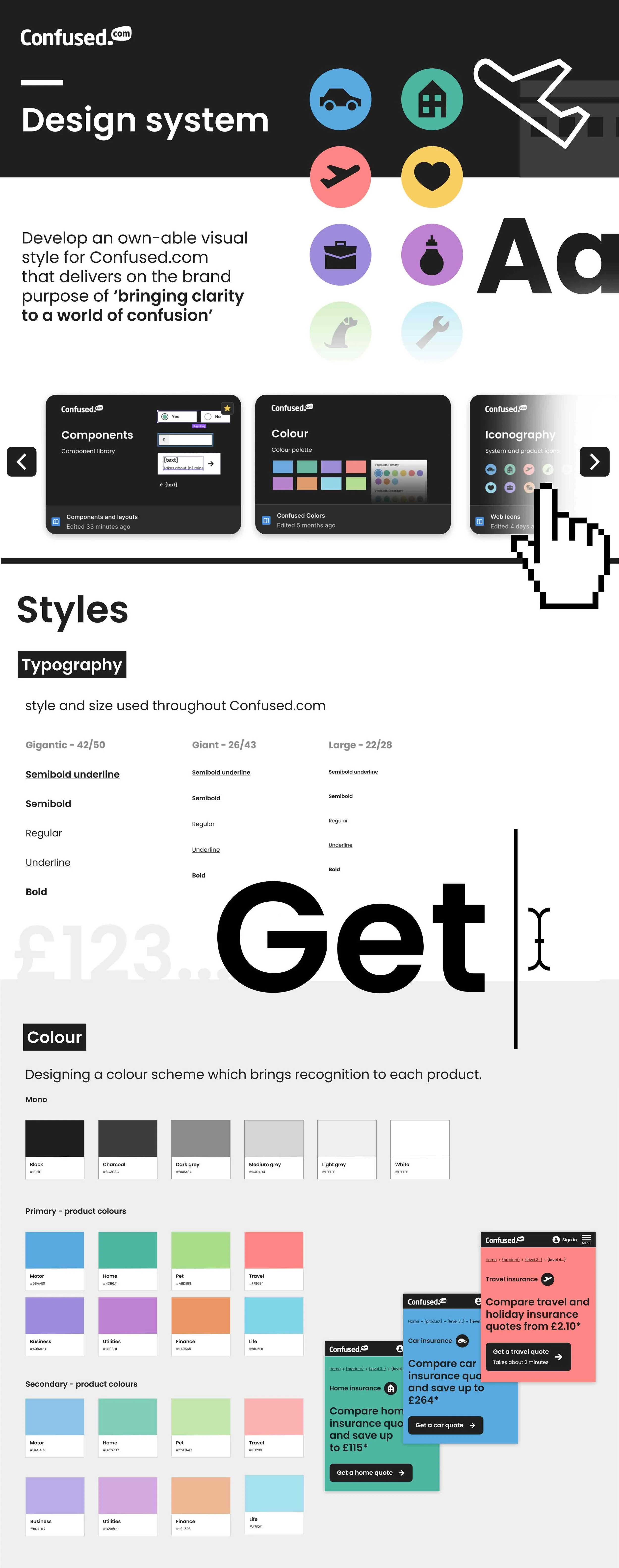
Confused.com needed a unified, scalable design system to align product, marketing, and internal tools. I led the creation of a simple, flexible, and accessible visual language that supports clarity across every digital touchpoint.
__________________________________________
The Challenge:
Rapid product growth had created inconsistent interfaces, duplicated components, and slow delivery cycles. The goal was to build a single source of truth that improved efficiency while reinforcing the brand.
__________________________________________
My role:
I led the design system initiative, collaborating with product, brand, and development teams. Responsibilities included:
• Defining design tokens (colour, type, spacing, iconography)
• Building a reusable Figma component library
• Embedding accessibility into all UI patterns
• Documenting guidelines in Zeroheight
• Running workshops to drive cross-team adoption
__________________________________________
Approach:
I began with a full UI audit to identify inconsistencies and opportunities for consolidation. Using these insights, I created the foundational styles and core components, then expanded into more complex patterns. Documentation and workshops ensured the system was easy to use, adapt, and maintain across teams.
__________________________________________
Outcome & Impact:
The design system became the central reference point for all digital design, delivering:
• Faster design and development workflows
• A consistent, brand-aligned UI across products
• Reduced duplication and improved team alignment
• A scalable foundation for future features and platforms
__________________________________________
Why It Matters:
This project demonstrates my ability to lead design direction, collaborate across disciplines, and create systems that improve product quality, speed, and long-term scalability.
__________________________________________
Results:
• 2× faster design and development velocity through shared libraries and reusable components.
• Improved cross-team collaboration, with designers, developers, and stakeholders aligned around the same visual and functional language.
• Streamlined third-party integration, supported by live, interactive documentation in Zeroheight and Storybook.
Today, the design system continues to evolve — a dynamic ecosystem that empowers Confused.com to scale confidently while staying true to its mission of clarity.